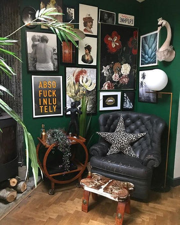
I am currently loving green …. It may well be an overflow from the huge trend we’ve seen over the last couple of years of the humble indoor plant. But however, it started its going to be a popular colour forecasted for 2020 by many interior bloggers. I’m going bold and moving away from the deep forest tones that been the leaders of the green hues in the paint world, in favour of a grassier tones.
This tone works beautifully with jewel tones and rich colours. Pair it with raspberry, gold and wood to create a cosy, inviting yet bold space. It also creates a beautiful and unexpected backdrop to hang art.
My suggestion would be to treat it as a feature only, adding a pop of colour rather than a full room (but hey! If you want to go bold who am I to stop you!). If you can’t commit to painting a wall it also looks amazing in furniture, like this example of a stunning green velvet couch.

And if you want to add a little bit more fun to this colour then opt for one of our green toned wall murals. Our picks from the range are Magnificent Menagerie and Monet’s Pond.


Featured above: Magnificent menagerie mural. Middle Monet's pond
Miss Lolo 'Violet' Eclipse flower bomb headboard, and bottom Resene Botanic, James Dunlop wallpaper
STYLIST'S TIP:
Stylists tip: Due to the intensity of the tone I suggest keeping the trims and ceiling a nice clean white.


